How can we help college students find internships they actually
qualify for?
Timeline
February 7, 2021 - February 25, 2022
Skills
Interaction Design
Sketching
Research
Prototyping
Team
Group Project (Lead)
2 Other UX Students
Project Overview
Students will be able to find internships that they actually qualify for
instead of having to search other job listing sites like LinkedIn. What
makes this site unique is it is like LinkedIn but for interns only. Not
only will students be able to search for jobs, but they will be able to
have resources about different careers and job tips, as well as other
features such as liking internship job descriptions, which will feed an
AI algorithm to give the student similar jobs to the ones they have
previously liked.
To solve this problem, we created a site based on LinkedIn because this
is a familiar site for our users, but we added new features and only
included internships. For the solution, I did all of the sketches for
the wireframes as well as I designed primarily the Profile page and
Landing page, but contributed to all of the pages.
This project was team based, where
I was personally responsible for leading the desk research, sketches,
wireframes, and desktop prototype.
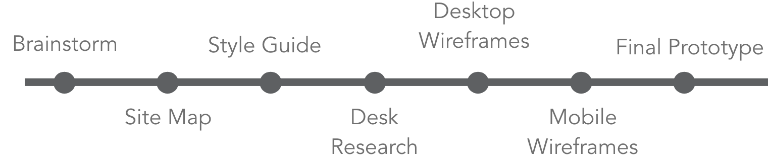
Process
Brainstorm
Potential features to help interns:
Filter
Search
Browse
Favorites
Profile
Salary - higher than average
Interview prep questions
Save search
Favorite search
Recommended interviews
Rating after internships
Jobs descriptions
Reviews for companies
The average salary for students
Student reviewers
Next Steps:
Once we had thought of some of the features we wanted to include, we
then thought of what pages should our site contain. We decided to do
some more preliminary research at sites like Glassdoor, Indeed, and
LinkedIn. We found that most of these sites had roughly the same pages
such as a landing page, job descriptions, companies, and careers. With
this research in mind, we chose these pages for our site: landing
page, job page, career page, and saved page.
Site Map
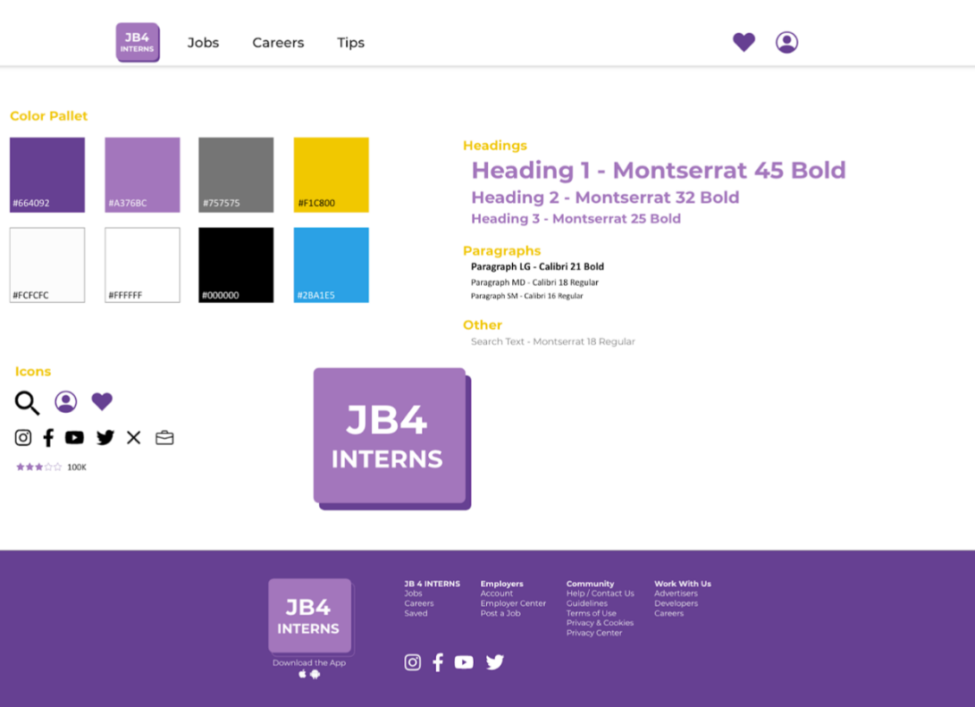
Style Guide
In our research, we found that companies like Glassdoor or Indeed
had one primary color and used different shades of gray, white, and
black in conjunction with the occasional pop of sub-color.
Based on color theory, purple often means independent or wise.
Then we looked on the color wheel and since purple is a secondary
color, we thought that if we used a different hue of some secondary
colors, this would help create contrast, so we decided to use blue
and yellow.
Desk Research
I conducted the desk research for all of the pages, but below is the
findings from the pages I ended up taking the lead on designing.
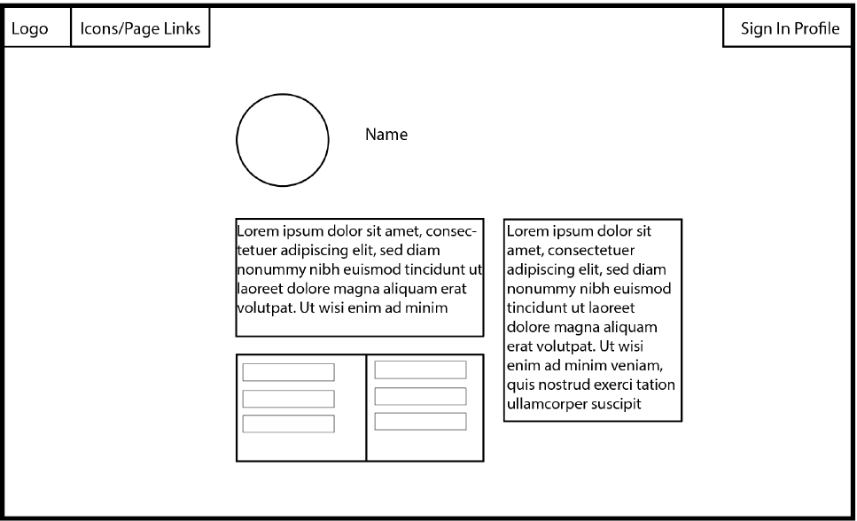
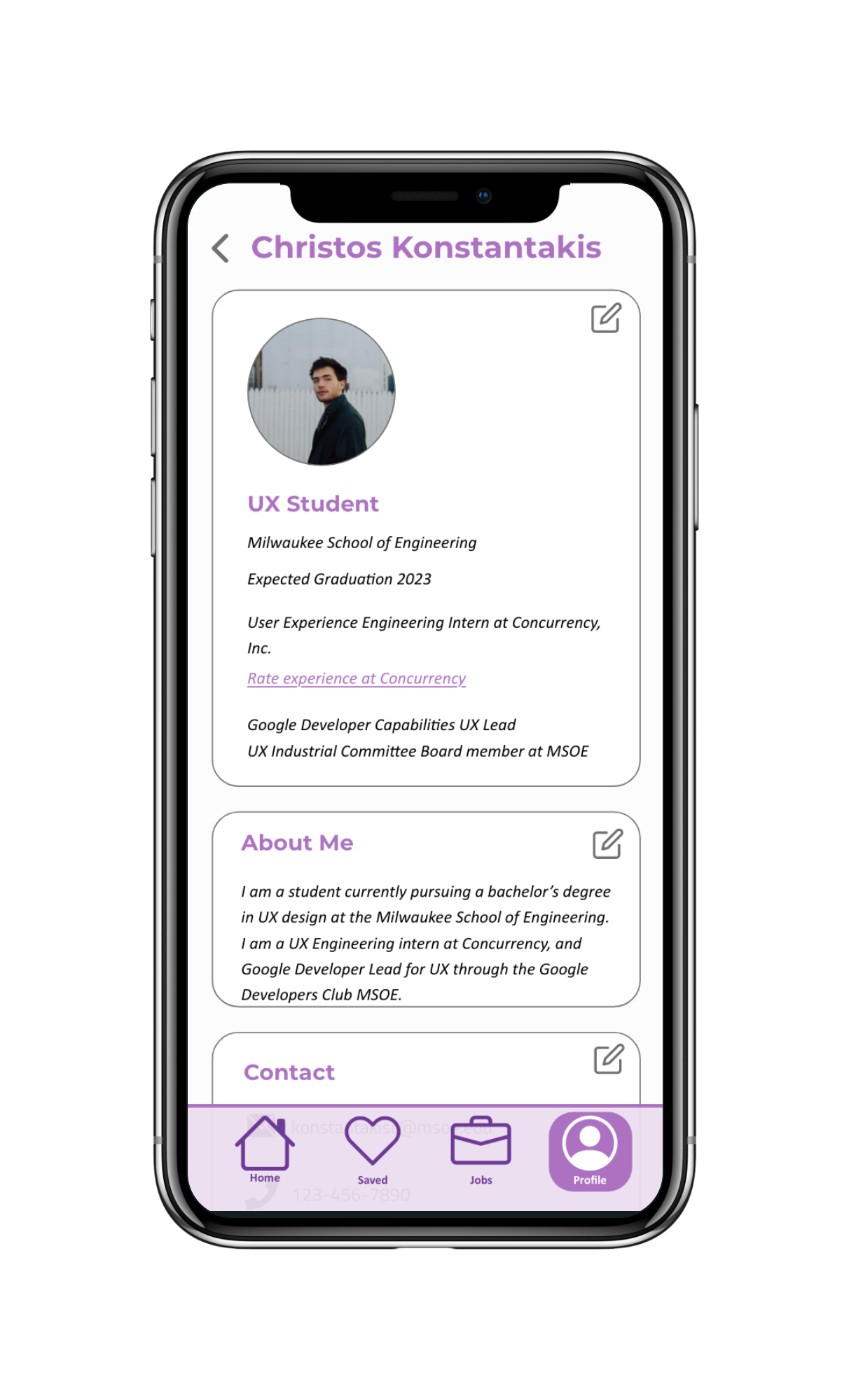
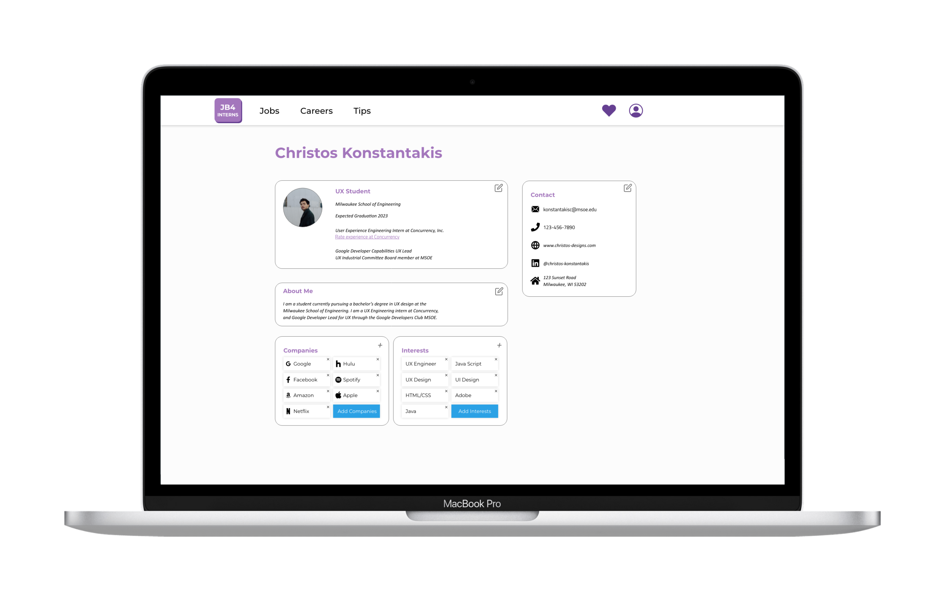
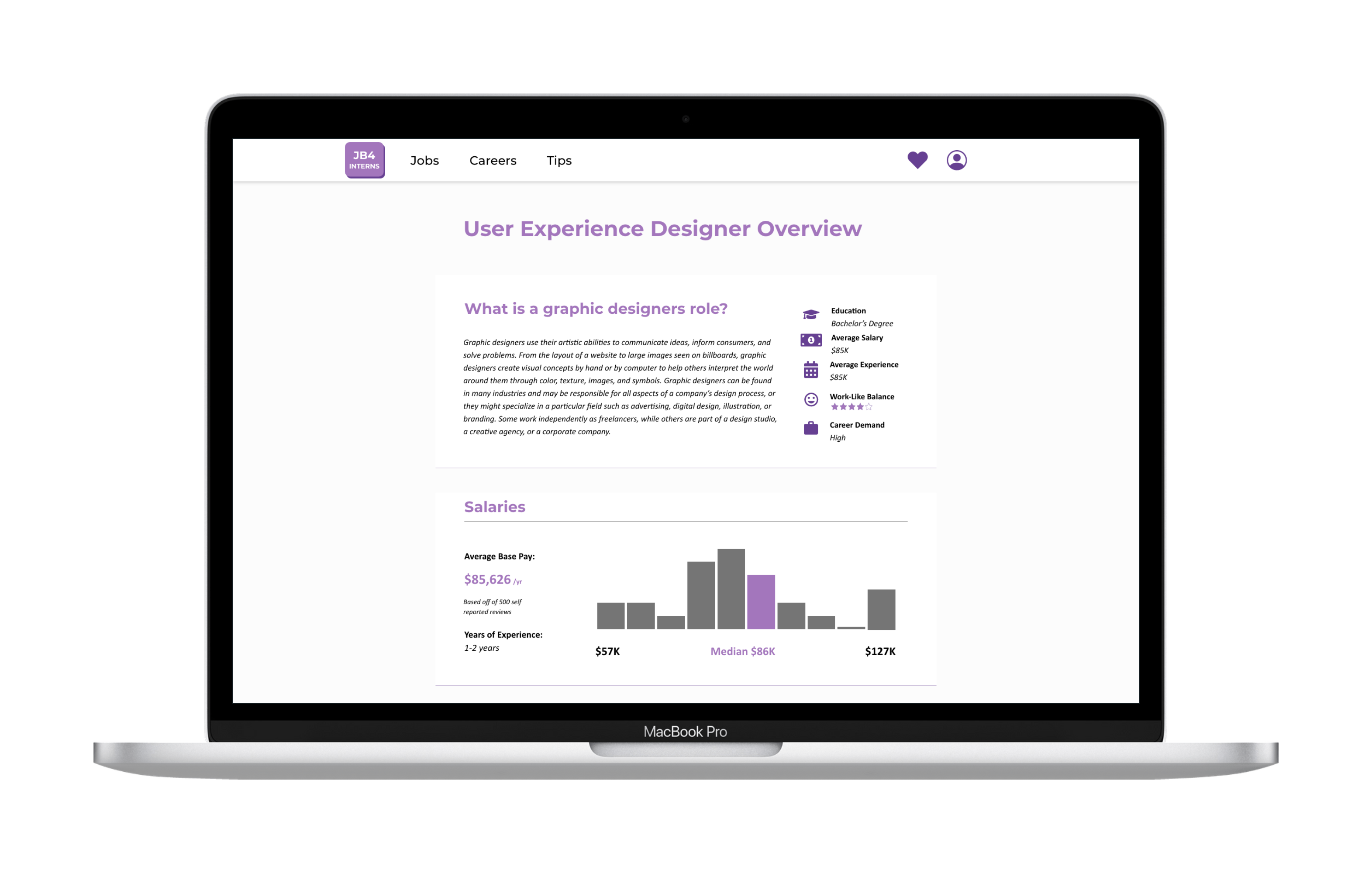
Profile Page
Goal:
How can you show a fair amount of personal data, yet allow the user to
make changes to their profile whenever they need to?
Findings:
Titled sections helped break up the information by grouping the
information
Tags make it easier for the user to make changes where needed
Include tags for the different skills, interests, and hobbies
Using tags in conjunction with the titled sections could help us
display the categorized information for both of our sections for
company and interests
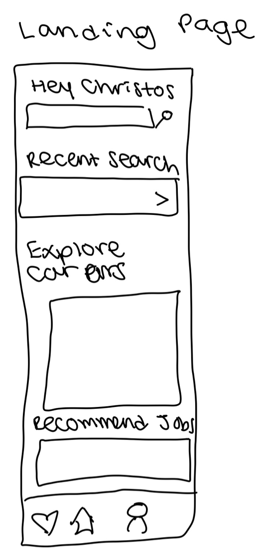
Landing Page
Goal:
How can we display a large amount of information in a scannable and
organized way to allow the user to be able to find what they are
looking for quickly?
Findings:
Hearts to save jobs for later
Use cards to break up the sections
Use titles to allow for scalability to find what section information
is located in a long list of cards
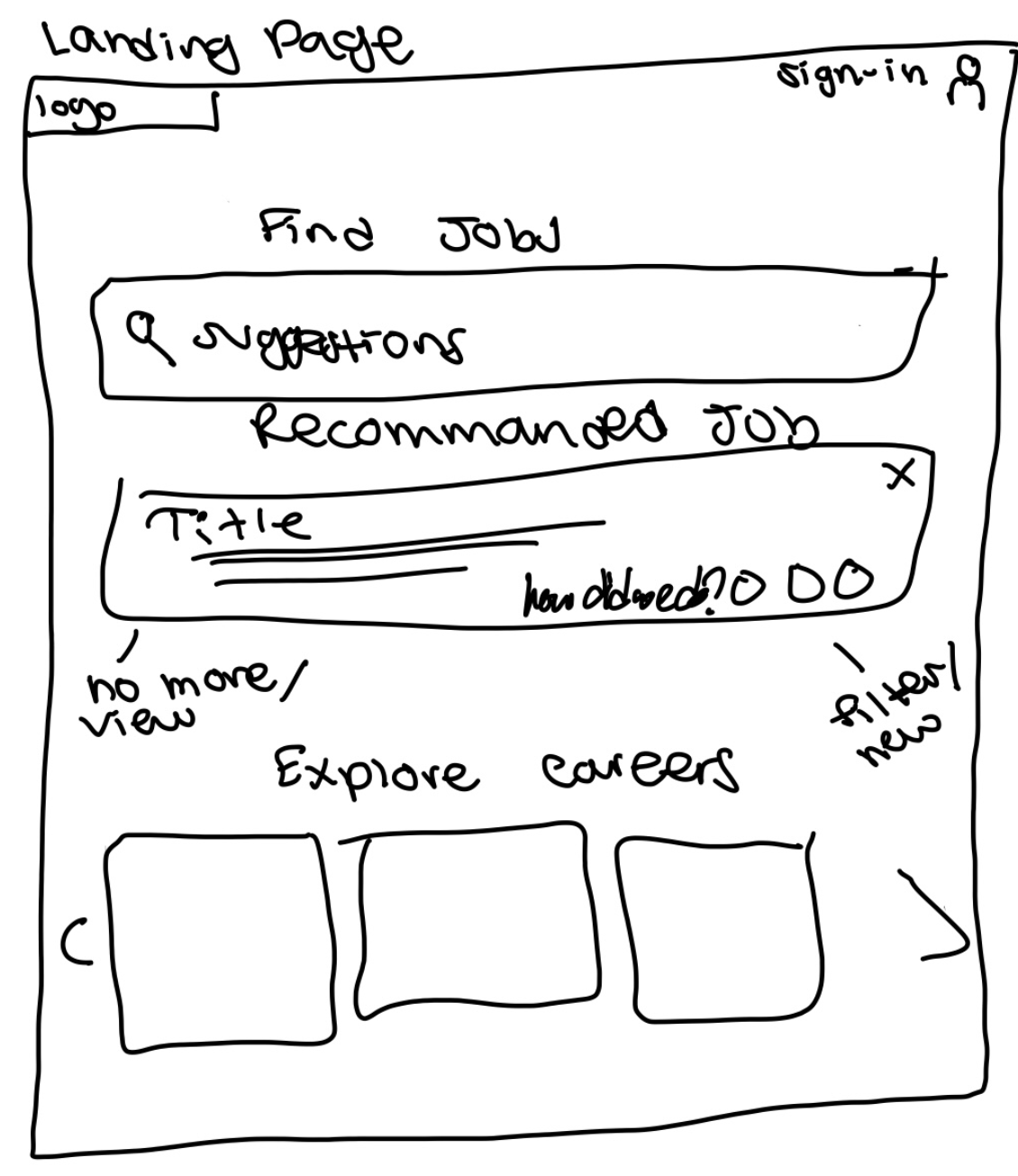
Wireframes
Desktop Low-Fidelity
Landing Page
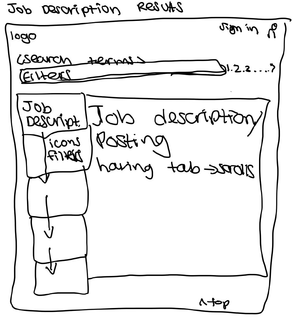
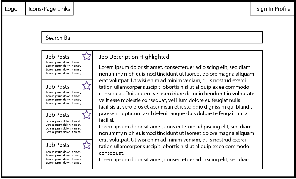
Job Descriptions Page
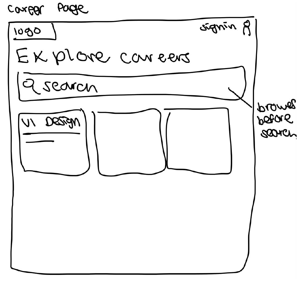
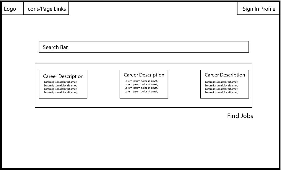
Career Page
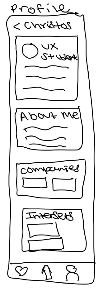
Profile Page
Desktop Medium-Fidelity
Landing Page
Job Descriptions Page
Career Page
Profile Page
Mobile Low-Fidelity
Landing Page
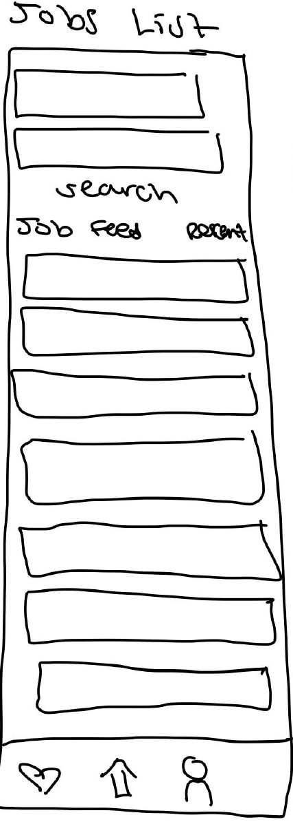
Job List Page
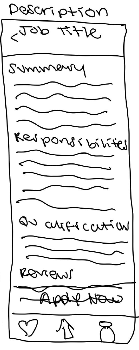
Job Description Page
Profile Page
Solution
We created an Adobe XD prototype for both a site for the web as well as a mobile app that combines
the best features from LinkedIn and Indeed.
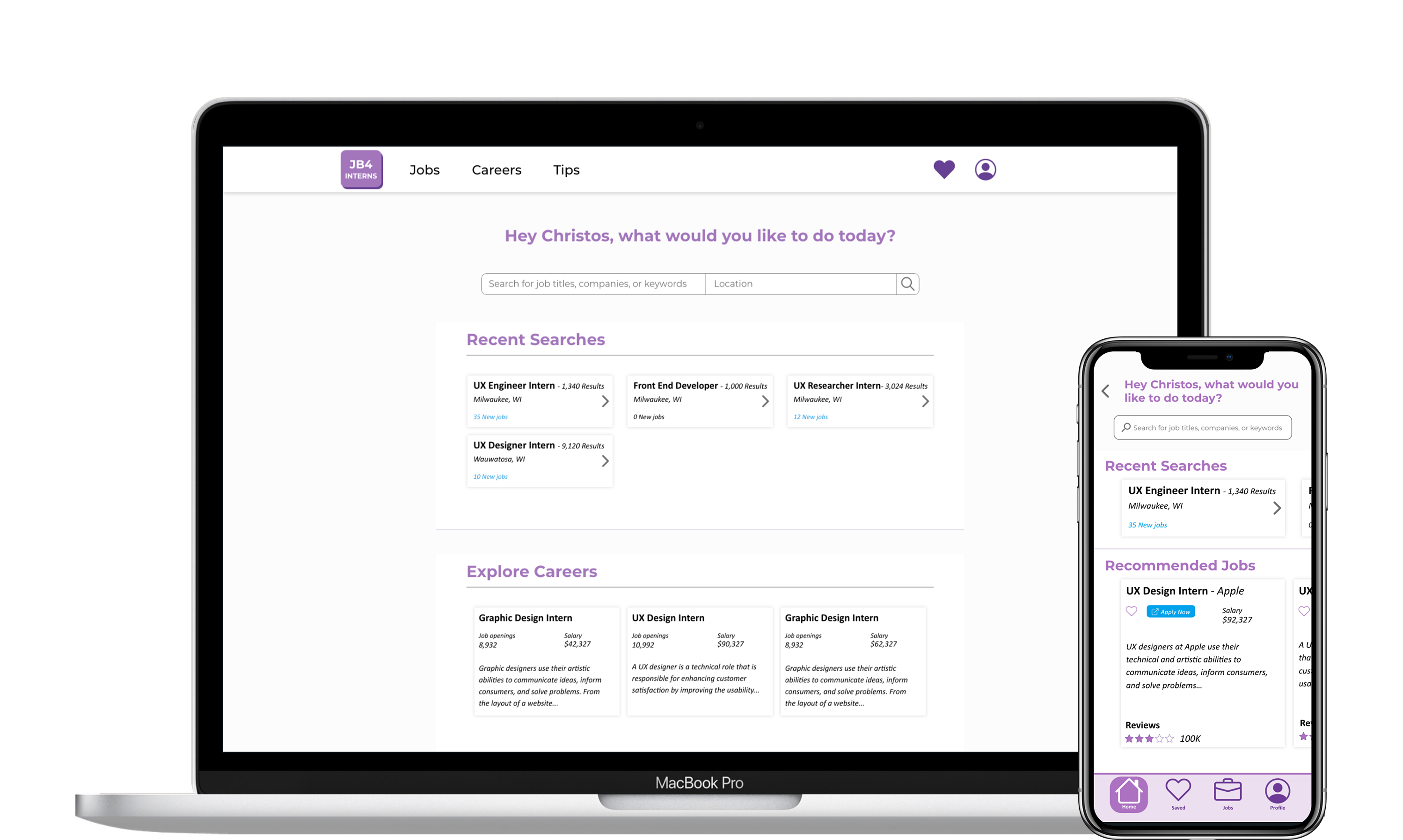
Final Prototype
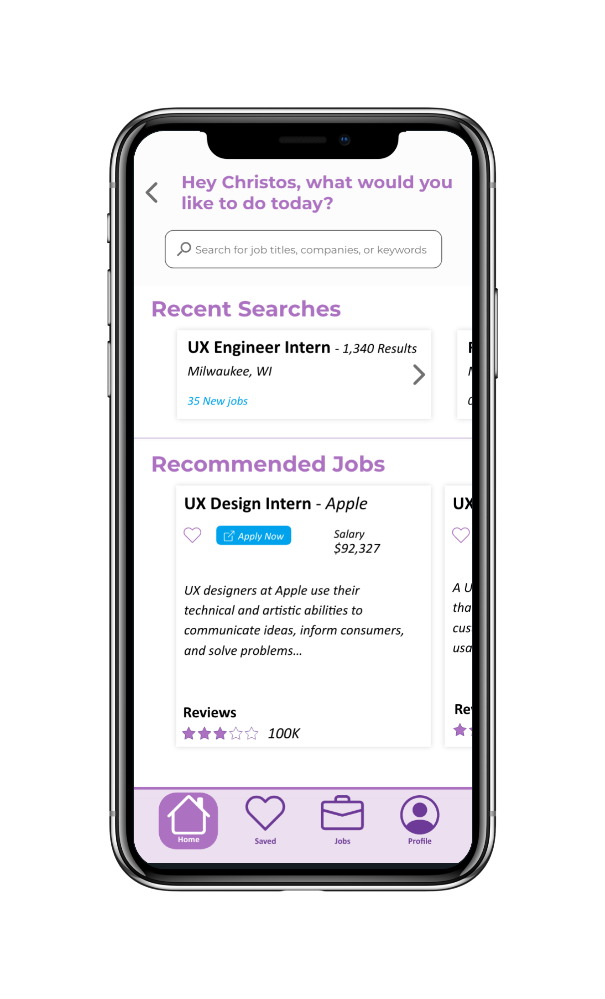
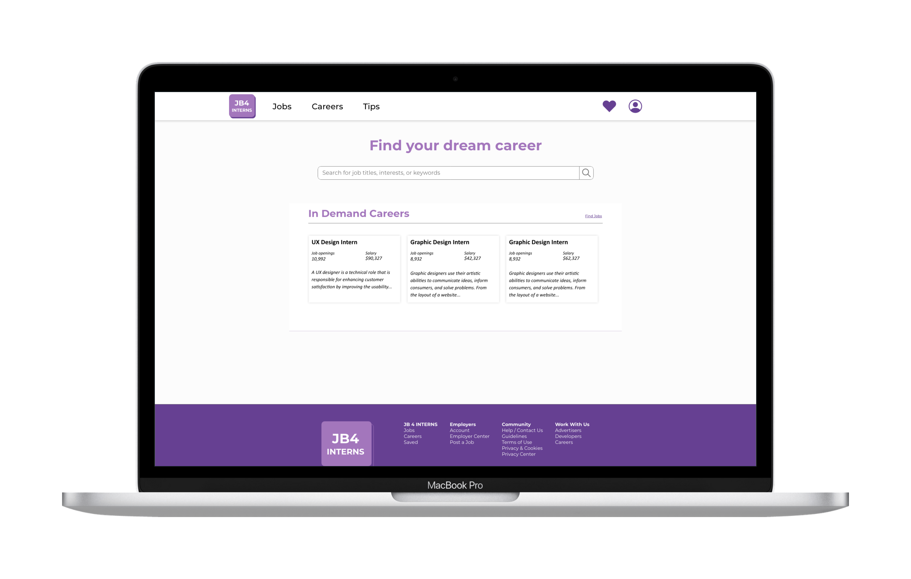
Landing Page
Job List Page
Job Description Page
Profile Page
Landing Page and Rational (Desktop)
Based on our research we wanted to incorporate the following features in our design for this page:
We thought the use of hearts to save jobs would help in the searching process because then the user could do all their searching and then apply to all of the jobs after they searched.
Since most job sites use a ton of information and statistics, we thought of using the element of cards and titled sections to help organize all of this information. The titled sections helped us break up the content into clear sections while the cards helped us create subsections within the section. Although cards are often used in conjunction with images we thought since there were various headings, sub-headings, paragraphs, and icons, this was still a good option because it helped organize each individual component like a job posting. Furthermore, we chose to incorporate cards because cards can also transfer well into mobile for the second part of the prototype.
However, since the main component or task required for this site is to allow users to be able to search for internships, we chose to break the habituation of the cards and highlight the search feature at the top of the page. Since the search feature is the most important part of this project, we chose to place it in the center and not in its own card. This created a level of contrast to draw the users’ attention to this section to help aid them in finding an internship.
The main challenge I faced while designing this experience was organizing the whole experience to ensure it was the same for both desktop and mobile. In particular one challenge I faced was understanding how the information architecture of this experience would be the same or different depending on the device the user was using. Since our goal was to design a consistent experience for both desktop and mobile, we had to understand and work with the different constraints of these devices to ensure if there were differences they were intuitive. Another challenge I faced was finding icons that were intuitive and that would describe what was going to be on that page. This was a big design challenge in the mobile version because we were replacing text with icons for some functionalities and we needed to make sure we were still developing the same consistent experience.
Overall, this project timeline was really short and if we had more time, we could have liked to do more design thinking processes like a usability study with current students and make iterations based on the findings.
Impact
By creating this experience we were able to create a one-stop shop for students to find jobs and learn more about careers on either a desktop or a mobile device. Additionally, we created an offering based on students' existing mental models to allow for a smooth adoption.
Lessons Learned
Through this project I learned how to take a problem with students unable to find jobs through existing sites and then research to help inform a solution based on what other sites do well. I also learned how to create an experience for both desktop and mobile and the importance of consistency for both experiences.