Crunchbase Dashboard


Challenge

Utilizing widgets to create a user-centric dynamically experience that adapts to users unique characteristics and preferences as they engage with Crunchbase.

Timeline

August 2023 - December 2023

Skills

  • Survey Writing
  • Data Analytics
  • User Interviews
  • Task Analysis
  • Competive Analysis
  • Data Visualization
  • User Testing
  • Team

  • 3 Researchers
  • 2 Designers

  • Project Overview

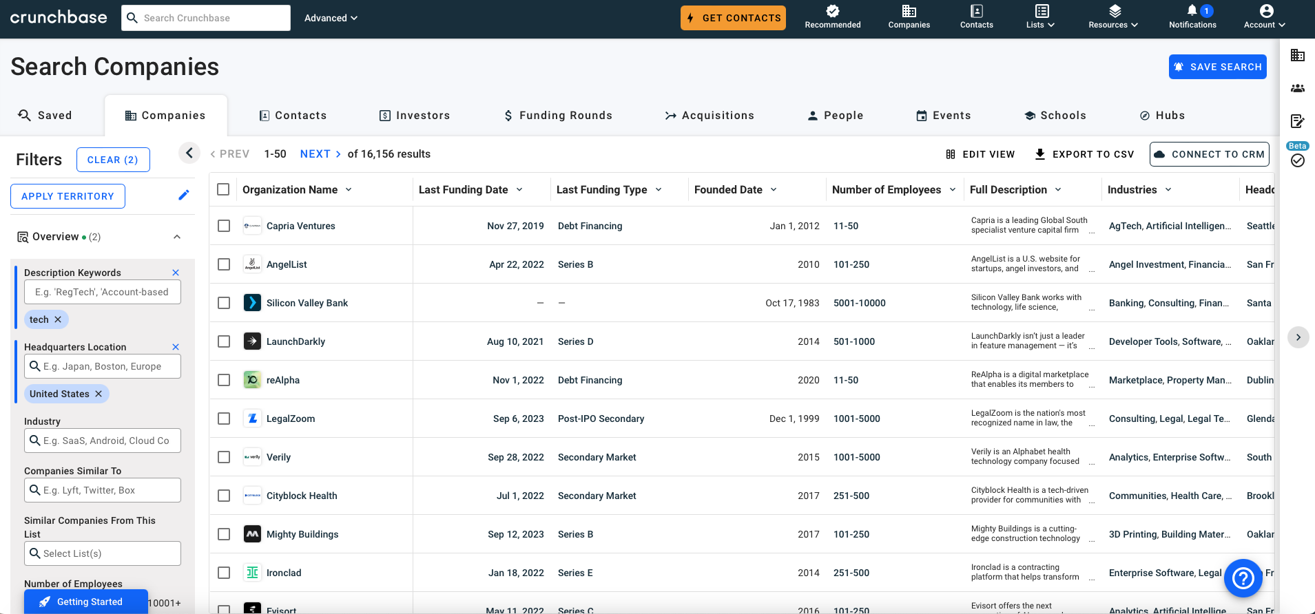
    Crunchbase is a company that offers comprehensive data on both private and publicly traded companies. By its role as a data-centric platform and smart prospecting software fueled by real-time company information, Crunchbase serves as a valuable tool for salespeople, CEOs, venture capitalists, and founders seeking to identify and finalize deals, secure investments, and conduct market research.

    My team and I have been tasked with understanding start up founders goals, needs, and pain points with the current site to ultimately create data visualizations to better present the large quantities of data.


    Process


    Understanding the Problem


    Goal:

    Crunchbase is focusing on customization to ensure users can access tailored data efficiently though data visualization to make complex information understandable and empower decision-makers.

    Problem:

    Crunchbase acknowledges it has not fully leveraged emerging technologies to improve its search functions and data visualization despite its extensive database. To address this, the company is focusing on creating tools to enhance the visualization experience for their current users. This effort aims to make their data more user-friendly and easily accessible, with the goal of enabling users to extract maximum value from their platform. Ultimately, Crunchbase aims to enhance its competitiveness in the market of business search engines.


    Problem Statement:

    How might we help Crunchbase incorporate accessible and personalizable data visualizations in the user interface to boost start-up founders use efficiency on this website?

    Target Users:

  • Start-up Founders
  • Market Researchers
  • Sales Professionals
  • Investors
  • Problem Significance:

  • New research area by focusing on start-up founders
  • There is little to no data visualizations on the platform today
  • The users need an efficient way for data-driven decision-making regardless of their role
  • Research Questions


    How can we create user-centric data visualizations for users' characteristics and needs?

    Sub-Research Questions:

  • What are the pain points of target users?
  • How can we improve the current usability problems of the website to make it more intuitive to users?
  • What are potential improvements for the user interface, accessibility, and personalization?
  • Survey

    Goal:

    Understand start-up founders' personal background and role at their company and their general experience with Crunchbase and competitors.

    Example Questions:

  • What does your usual workday entail? (Select all that apply)
  • What are your top 3 time-consuming tasks to complete your job responsibilities? (Select all that apply
  • What features do you use the most on Crunchbase? (Select all that apply)
  • For what reason(s) do you choose not to use Crunchbase? (Select all that apply)
  • Analysis and Findings:

  • n=21 after cleaning n=12 (removed not complete responses and responses from users who are not start-up founders)
  • Use platform for networking, competitive analysis, and to find investors
  • Use other tools like LinkedIn to help with their tasks on Crunchbase
  • These findings validated the need for data visualizations and gave us general information about our users


  • User Interviews

    Goal:

    To dive deep into growth opportunities for Crunchbase by understanding what being a start-up founder entails and how these users use or not use Crunchbase.

    Context:

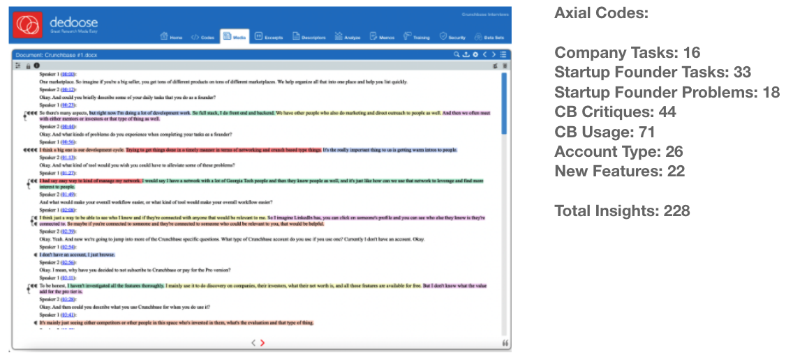
    Interview 4 startup founders to understand their job, their company, and how Crunchbase fits or does not fit into their role. Each interview was between 15-30 over Zoom and the transcripts were analyzed using Dedoose.

    Examples of Questions:

  • What kinds of problems do you experience when completing your daily tasks as a startup founder?
  • Could you share your screen and show us and explain your process as you go through an example of a day-to-day task you perform?
  • What would make your workflow easier overall?
  • Analysis:

  • n=4 participants
  • Transcripts where analyzed on Dedoose by using open coding and axial codes to ultimately find themes of insights
  • Findings:

  • Users need quick and scannable information
  • Ability to make comparisons between companies and industries
  • Connect with others safely
  • These findings validated the need for data visualizations and gave us new insights how startup founders interact with stakeholders


  • Competitive Analysis


    Goal:

    To see where Crunchbase fits in relation to their competitors and what we can learn from the competitors.

    Context:

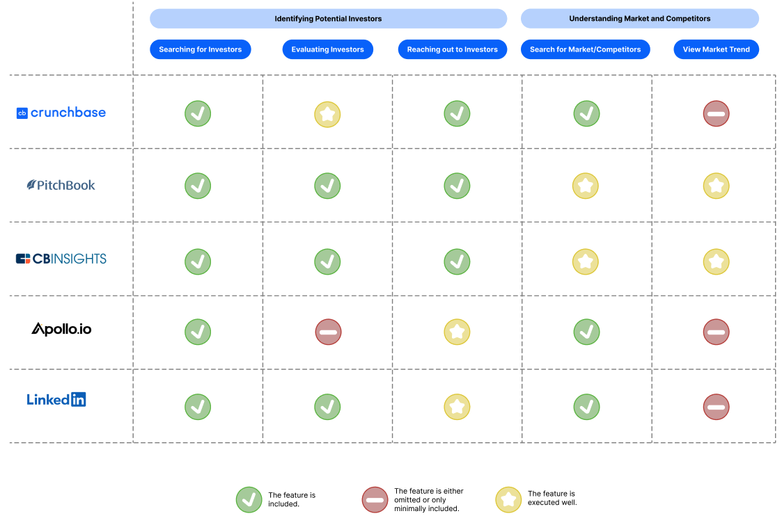
    Conducted the analysis on Crunchbase, Pitchbook, CB Insights, Apollo.io, and LinkedIn. Each platform was ranked on identifying potential investors and how to understand the market and competitors. There was a collection of screenshots and text to document the process and then we pulled the insights and ranked each platform using green, yellow, red dots to highlight their performance. (I lead the LinkedIn Analysis)

    Analysis:

    I personally lead the analysis for LinkedIn were I reasearched how LinkedIn stood on these five categories: searching for investors, evaluating investors, reaching out to investors, search for competitors, and viewing of market trend.

    Findings:

  • Crunchbase is good for evaluating investors
  • Improve search experience
  • Use AI to help find investors
  • Create a new feature to see market trends
  • Hierarchical Task Analysis:

    Goal:

    To understand the step-by-step processes start-up founders do in their daily responsibilities to find pain points and evaluate the user experience.

    Context:

    Analyzed 5 different tasks by completing a site walk-through and noting the steps in detail to make hierarchical task analysis tree diagrams for each task.

    Analysis:

    I created the tree diagram for conducting market research by competitors while using Crunchbase.

    Findings:

    To understand the findings we filled out this chart for the diagram we created to highlight the important aspects of the findings.

    Persona


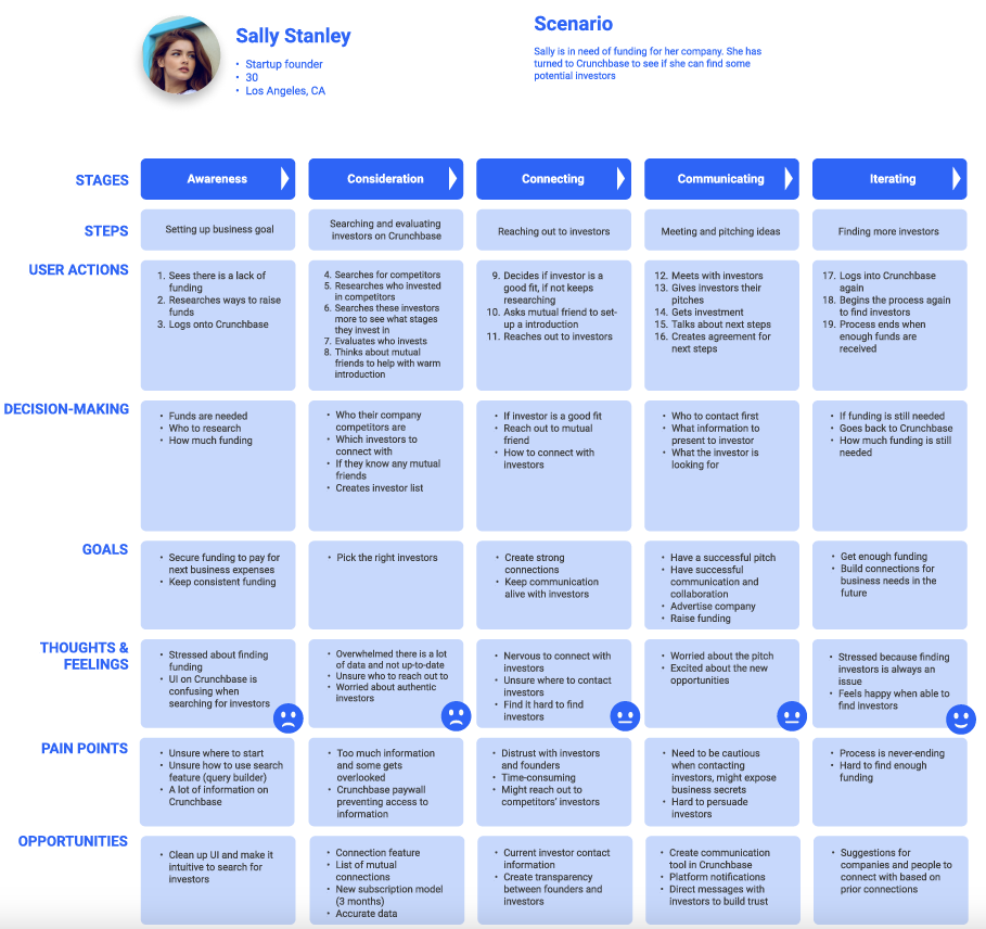
    Journey Maps


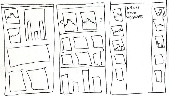
    Ideation

    Rapid Prototyping


    Concepts

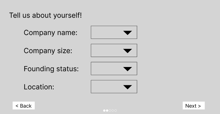
    Onboarding

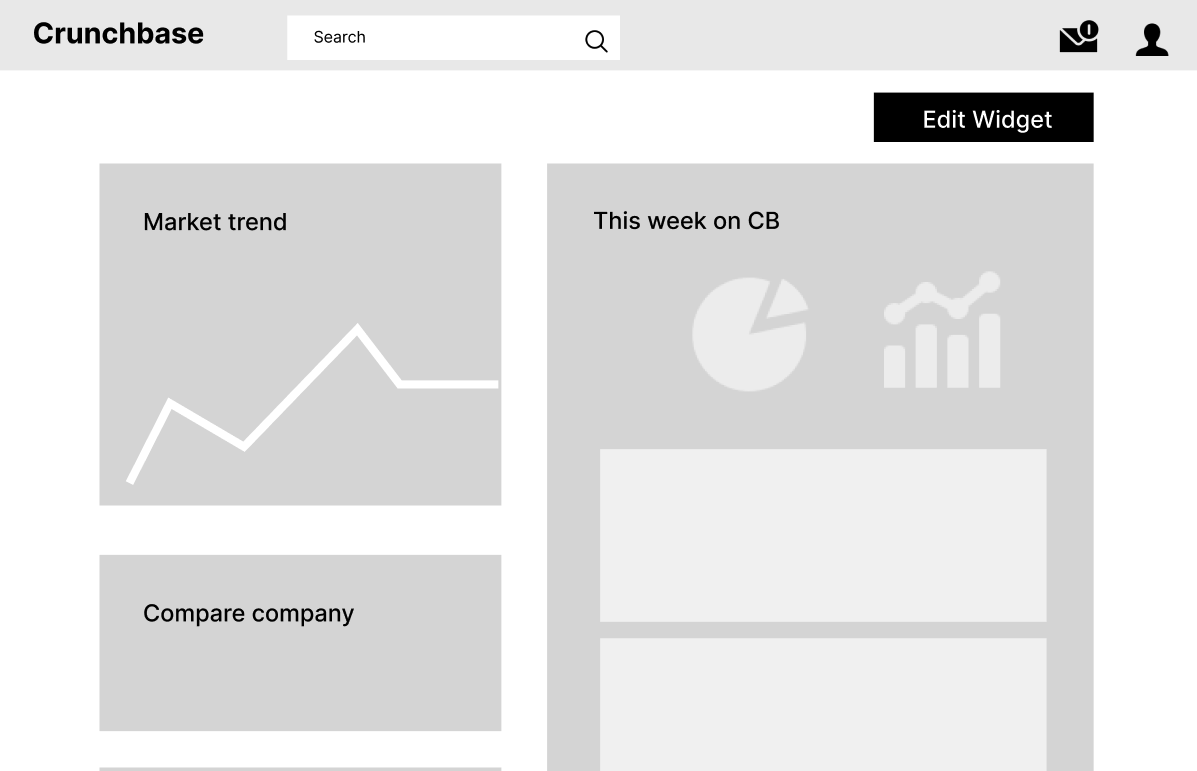
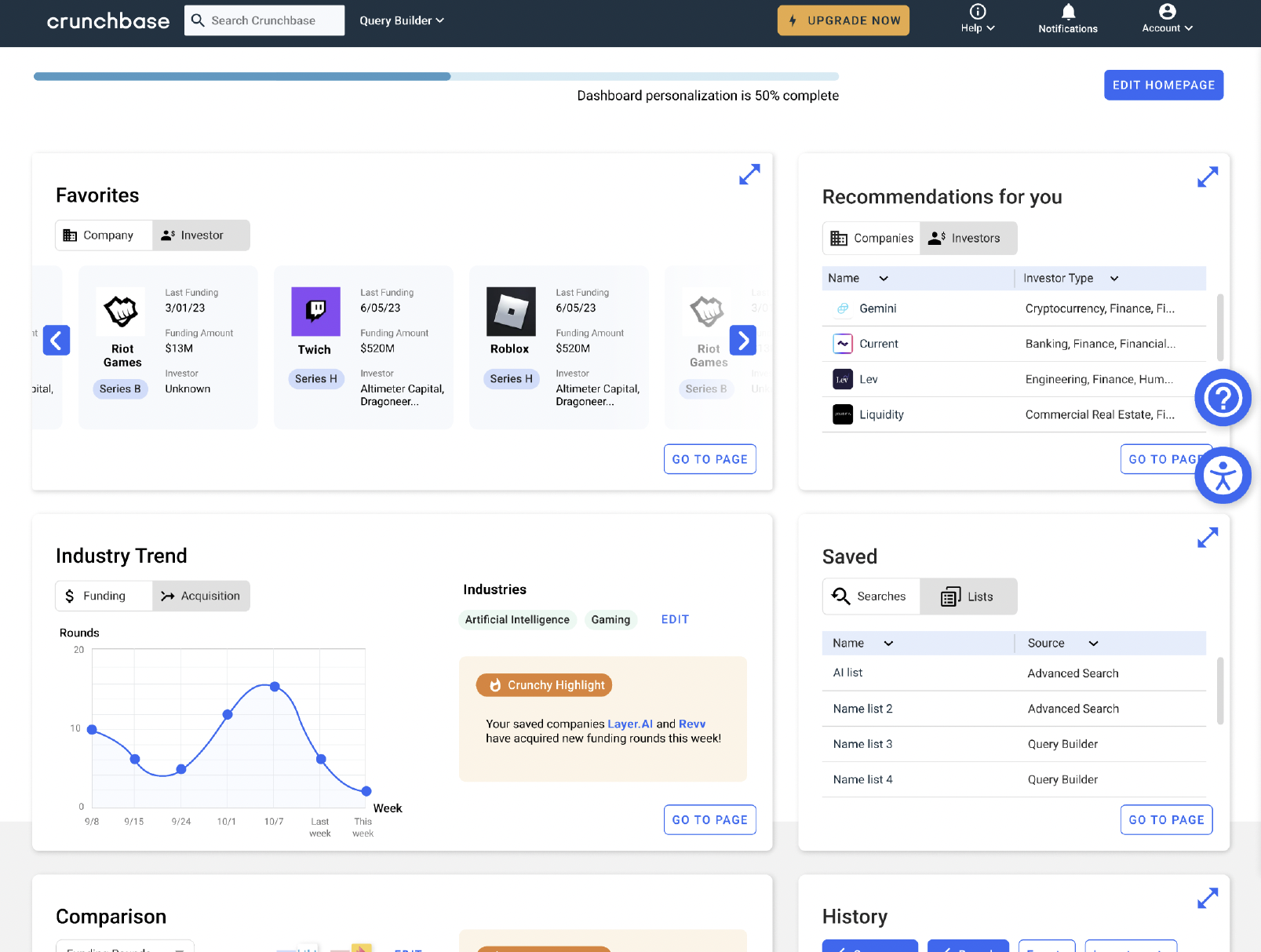
    Homepage

    Company Compare


    Prototyping

    Low Fidelity Prototype


    High Fidelity Prototype


    Usability Testing

    Expert Testing

    Logistics:
  • 60 minute Heuristic Evaluation
  • Participants: 3 Crunchbase Designers and 1 Human Factors Professor


  • Task: Asked experts to rank Heuristics on a scale of 1-10 and describe their response

    Rationale: Get an expert perspective on both Crunchbase's design and data visualizations through qualitative and quantative data

    Analysis:


    Codes:
  • Unclear Issue
  • Unclear Selections
  • workflow & Usability Issues
  • UI Problems
  • Unclear Expectations
  • Information Overloading


  • Worst Heuristic Performance Averages:
  • 6.49 - Visibility of System Status
  • 5.75 - User Control & Reversibility
  • 4.50 - Help Users Recognize, Diagnose, & Recover from Errors


  • Target User Testing

    Logistics:

  • 60 minute interviews/usability testing
  • Participants: 5 Start-up Founders


  • Tasks:
  • 2 tasks - prototype tasks
  • 4 tasks - same task on prototype and Crunchbase
  • Task perforance and self reported metrics


  • Rationale: Test the functionality of the prototype compared to Crunchbase and get general feedback


    Qualitative Findings:
  • Color on the toggles are confusing - users couldn't discern what was selected
  • Inconsistent hoverability function
  • Users had a preference for more customizability; for both data on widgets and widget affordance
  • Edit homepage interaction is unexpected


  • User Quotes:
  • "Much easier to use prototype; better user experience & easier to find information"
  • "Super smooth process, easier than Crunchbase"
  • "Really hard to find things on the current Crunchbase page design"


  • Findings:


    Impact

  • Highlighted the importance of start-up founders as a unique target user group for Crunchbase
  • Research informed design for a personalized features and more data visualizations

  • Lessons Learned

  • Learned how to recruit users for studies while facing many challenges not finding enough participants
  • Understand a complex system to simplify the platform


  • More Projects