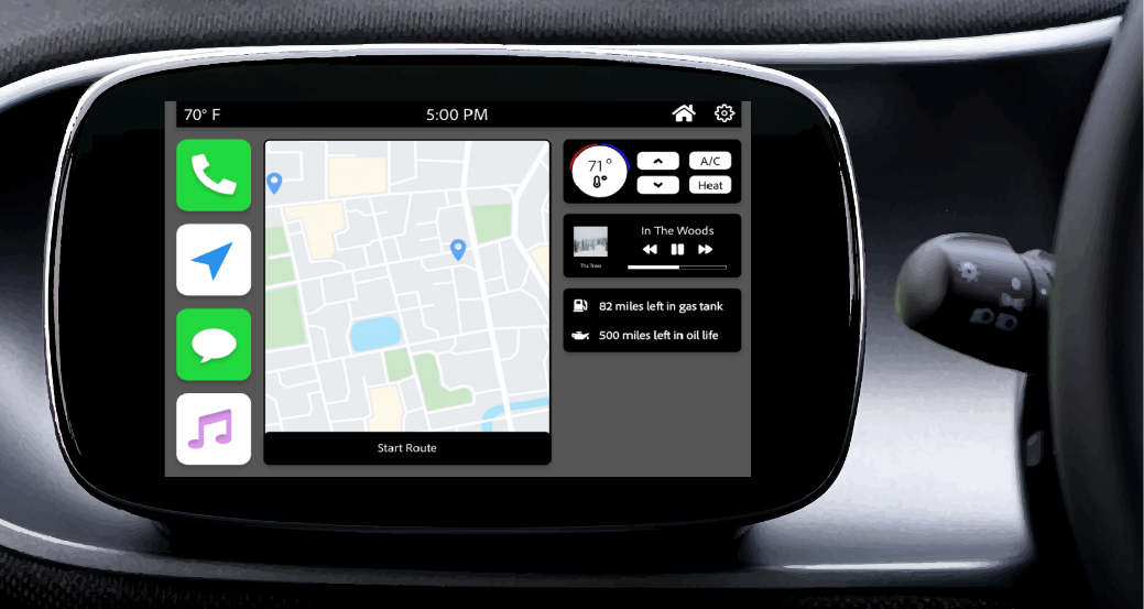
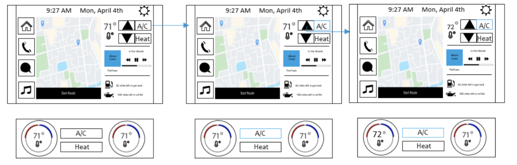
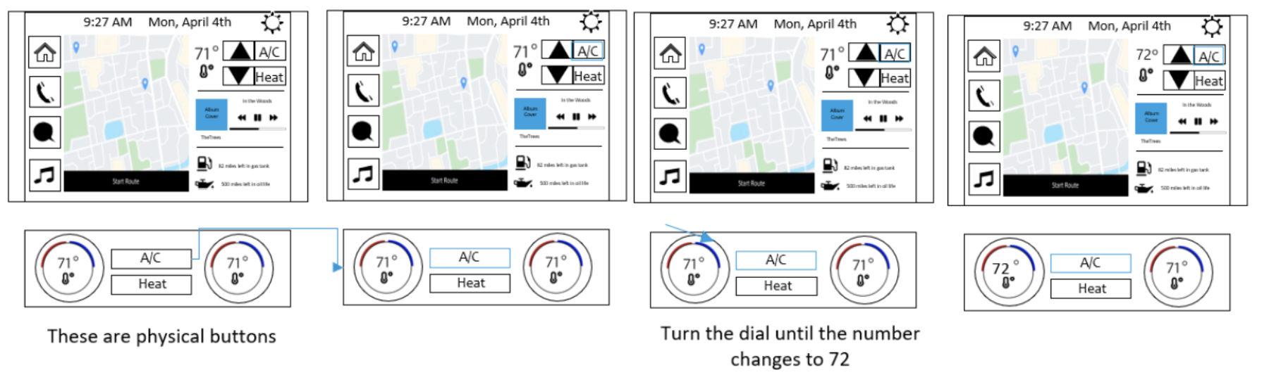
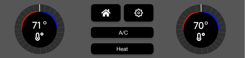
Car Infotainment System


Challenge

How can we help drivers navigate through their busy lives and the road?

Timeline

March 7, 2022 - May 20, 2022
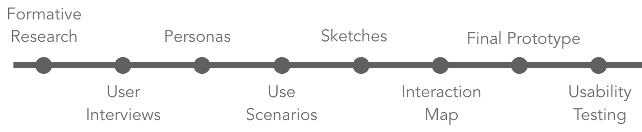
Skills

  • Interaction Design
  • Sketching
  • Research
  • Interviewing
  • Usability Testing
  • Prototyping
  • Team

    Group Project (Lead)
    2 Other UX Students

    Project Overview

    Drivers will be able to use touch and physical controls to navigate through this infotainment system to be able to accept/reject phone calls, listen to a text message, change the source of the audio, turn on the A/C, and start a navigation route.

    This was done by researching existing car infotainment systems to help guide our own original design, using Adobe XD.

    Although this was mainly a group project, these parts were completed individually, by myself: Key Level Modeling, heuristic evaluation, and sketches. When collaboring with the team, I led the designs for A/C and navigation features. I also lead the research components by writing the interview script and anlyzing the results for this project.


    Process


    Formative Research

    Desk Research using Key Level Modeling and Heuristic Evaluation:

    Testing the PCM infotainment system on its ability to complete the tasks of accepting/rejecting phone calls, listening to a text message, changing the source of the audio, turning on the A/C, and starting a navigation route.

    Heuristic Evaluation I learned:

    1. The tasks lack error prevention
    2. There are little to no shortcuts in the system and there is only one golden path
    3. Changing the source on the audio is extremely challenging, especially because of the lack of visibility, real-world language, and recognition of recall

    Key Level Modeling I learned:

    1. Listening to a text message was very complex, taking 6.4 seconds and 4 total 'clicks'
    2. Rejecting phone calls took 1.6 seconds and 1 total 'click'
    3. Starting navigation took 1.6 seconds and 1 total 'click'
    4. Changing the source of the audio took 4.8 seconds and 3 total 'clicks'

    User Interviews

    We conducted 5 interviews with current infotainment system users and 5 interviews with potential infotainment system users (users who can drive but do not drive a car with an infotainment system). We then synthesized the data and discovered that our current user population was mainly non-tech-savvy, middle-aged adults who posed an interesting challenge for us, which left our potential user population to be young, tech-savvy adults that mainly could not afford cars with infotainment systems.

    Personas

    Primary User: Older Adult

    Secondary User: Young Adult

    Use Scenarios

    Switching Modalities; Switching audio to navigation and ending navigation

    Karen is trying to drop her kids off on their first day of school and wants to know what the traffic is like for this drive, so they are not late. So, she turns off the music that her kids enjoy listening to and instead switches to navigation. Then once she drops the kids off at school, she stops the navigation and starts listening to her favorite radio station.

    Using radio/media; Switching from AM to FM radio

    On her way to her weekly Sunday morning Peloton class, Karen wants to switch off her morning news and get some energy with the pop music station before her class, so she switches from the AM news to an FM radio station.

    Using the phone; rejecting incoming calls; listening to the text message

    We find Karen in a rush to get from work to her doctor's appointment on time and back to work before her break is over. On her way to the appointment, she is on the phone with her husband, but then her boss calls to check the status of her team's progress report for their next deal. She rejects the call from her boss but then uses voice commands to hear the message back from her boss.

    Adjusting Climate Control; Turning on AC and adjusting it to 72 degrees

    After Karen's Peloton class, she likes to turn on the climate control and set the air conditioning to 72 degrees to keep her cool on the drive home.

    Sketches

    Next, I sketched out some ideas based on our personas' needs to understand some of the possible touch interactions. Below is a sample of the sketches for turning on the A/C feature.

    A/C Touch

    A/C Controls

    Interaction Map

    Then we collaborated and created a medium fidelity interaction map based on our individual sketches, in which we drew elements from everyone's sketches for this medium fidelity version. Below is a sample of the sketches for turning on the A/C feature.

    A/C Touch

    A/C Controls

    Solution

    We created an infotainment system that uses both touch and control with a voice command (out of the scope of the design). We combined research from both luxury and standard infotainment systems to create a system with little or no learning curve.


    Final Prototype


    Controls Pannel

    (Located directly below the screen)


    Features of Design:

    One pattern we used was similar, since we discovered in our foundational research that most of our users had iPhones, we designed our infotainment system based on an iPhone UI. As many of the icons and apps are very similar which relates to the user's mental model for these functionalities.

    We also chose to create our design based on the pattern of color and particularly using high contrasting colors because from our foundation research we found that many of our users were older and having high contrasting colors could help usability. Additionally, our home screen follows the pattern of a dashboard since there are many different-sided modular sections. This also ties back to the pattern of similarity, having different-sized modules resembles the home screen an iPhone user might choose to use. Finally, each page has an escape hatch being the home icon on the top right corner and in the physical controls, this helps the user return to the dashboard home screen at any time.

    Overall, some design principles we used on the home screen were in contrast as described above with the high contrast of black background with white text. We also used the design principle of proximity by putting apps close together on the left and on the right with all the car details and settings. Also, we used alignment, one example is we aligned all the apps on the left.


    Sample of Workflows:

    For this workflow we knew based on our research, that our audience is older, so we wanted to keep their same mental model of controling the A/C with physical buttons/controls. But we also made this functionality able to be controlled using touch to appeal to our younger audience we are more tech-savvy and are used to using touch screens more.


    View A/C Touch Flow

    View A/C Controls Flow


    Usability Study Results

    Key Quotes
    "I thought it was easy to use because it resembled my iPhone really well!"

    "Easy to see the large red button that popups when a call is received."

    "Really easy to find the temperature on the infotainment system screen."


    Summary of Insights
    Wanted to know stats about the car, like when they could get their next oil change or how many more miles they have until they need to

    Confused why there are two home buttons (one touch and one control)

    Confused about the settings section since there are so many drill-downs

    Make the highlight for controls thicker


    Improvements Based on the Insights
    We addressed the want to know more about the car stats by adding a section with this information below the music section

    We decided to keep both home buttons because in our original user interviews we gathered alot of data that supported the fact that users wanted to be able to use both touch and controls to complete a task.

    If we had more time we would have liked to redesign our settings screens to eliminate some of the drill downs.

    We addressed the highlight for the controls section and made the line thicker.


    Notiable Considerations
    We tested this prototype on a laptop with 5 users, in would have been more ideal if we tested this system while driving in a controled enviroment.

    An improvement we should have done would be testing which features should be disabled when driving and which features should be available at all times to prevent user errors and for overall safty purposes.

    Challenges

    One challenge we faced was designing controls while using Adobe XD, which is a 2D design program. This made the prototype seem really flat and hard to tell which parts were touch and which parts were controls. This was a problem we noticed when we did our usability tests and probably influenced our results.

    Another challenge we faced was designing for a wide range of users with a very broad range of technical knowledge. What was interesting was our primary users were old adults who generally are not very tech savvy but their older children or young adults in general were our other users who might also drive this car, so we had to make sure the car was techy enough for them but the older adults were still able to understand how to use the car.

    Impact

    Our car infotainment system had a SUS (System Usability Scale) Usability Score had an average of 61.25 out of 100, with 68 being above average.

    We decreased the number of interactions from 4 to 2 for listening to a text message (compared to our KLM testing).

    We decreased the number of interactions from 2 to 1 for moving to the navigation feature (compared to our KLM testing).

    Lessons Learned

    This product taught me personally a lot more than just the UI design. One of the first concepts I learned was what Key Level Modeling is and how this can help guide the design by highlighting pain points in specific areas of improvement. Another skill that I learned was how to work in a field like the automotive industry where there are a lot of constraints mainly with safety. This is why understanding Key Level Modeling was so important because I could have designed a beautiful UI, but if the UI has too many interactions or cognitive load, this will not only be ineffective for the driver but creating a safety concern for others on the road. Finally, I learned how to think about the big picture of the experience and beyond just the UI, mainly my team and I had to think about all of the interactions with the physical buttons and how those would interact with the display, as this was the first time I designed an experience that had both touch and control features.


    More Projects


    Jobs for Interns

    Jobs 4 Interns

    Its like Indeed but just for interns.


    More Projects