


Research Findings |
User Needs |
Design Implications |
|---|---|---|
I would take furniture from a family or close friend. Not a stranger. |
Purchasing furniture from trustworthy sources |
Building trust through creating a sense of community or familiarity |
92.6% of the people in the survey said they consider the style while purchasing furniture. |
The style of the furniture should match the users' aesthetic preference |
Offering options for users to choose the furniture by style |
59.3% of the people in the survey said they had purchased furniture both online and offline. |
Users have different preferences regarding how they purchase furniture |
Making it flexible for people to interact with the system both online and offline |
Many students said they purchased second-hand furniture because of the lower prices. |
Users need affordable furniture |
Offering affordable furniture and appropriate buy-back prices |
I would prefer to buy second-hand furniture from people living in the same building since I don't have a car. |
Ease of transporting the furniture is important |
Providing cost-effective ways for transportation of large pieces of furniture |
I'm afraid of bed bugs. Second-hand furniture is usually broken - low expectation of the condition of the furniture. |
Users want clean and high-quality second-hand furniture |
Constructing concrete system for quality and cleanliness proof |
Many students don't know where to purchase second-hand furniture |
Users need to have access to the information about how to purchase second-hand furniture |
Promoting through popular platforms that the users are using nowadays |
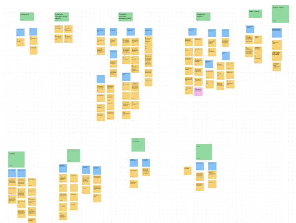
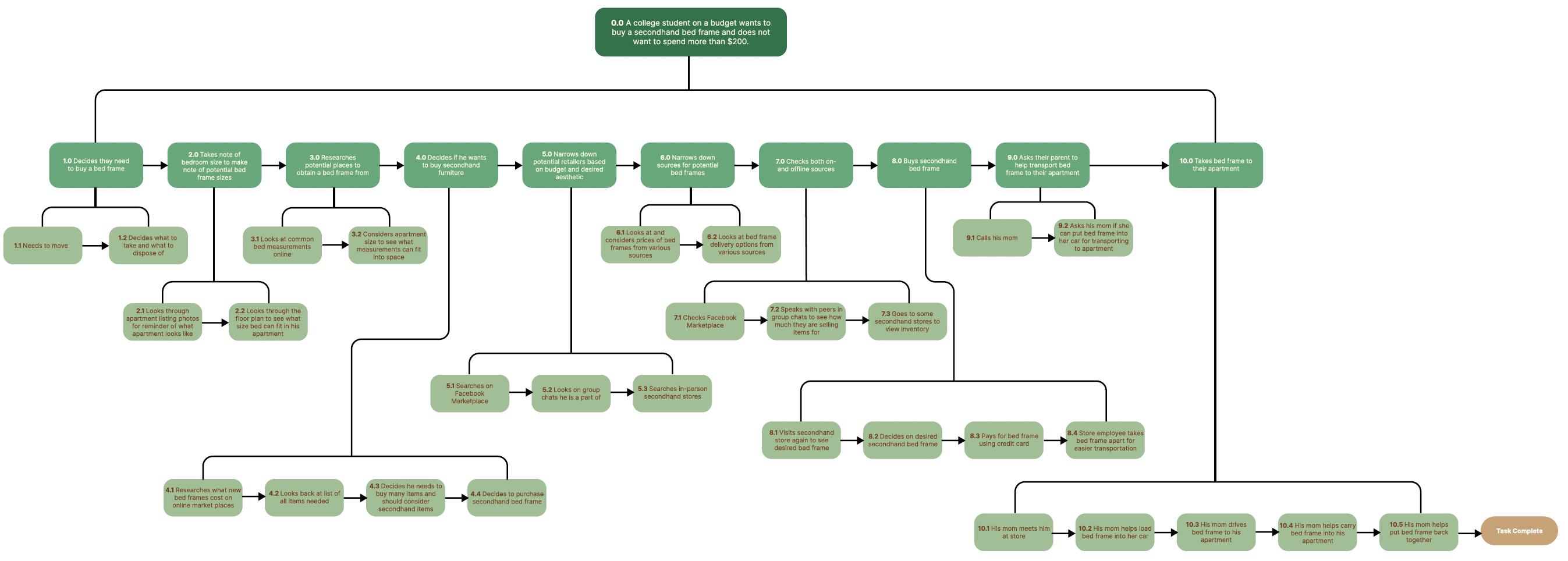

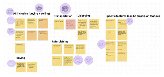
Step 1: 250 Initial IdeasCollage boards and 50 ideas in 10 minutes |
Step 2: 50 Selected IdeasDot voting and team discussion |

|

|
Step 3: 10 Refined IdeasDiscussion and brainstorm |
Step 4: 2 Storyboards |
|

|
A self-driving truck that drives around a robot that will assist users in moving furniture to their next apartment or a donation center.
|

|

|

|
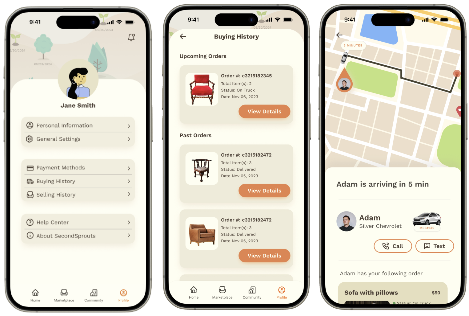
Low Fidelity Prototype |
High Fidelity Prototype |

|

|

User Finding |
Design Implications |
|---|---|
Users expressed concerns towards the readability due to the small font on the order detail page. |
The design should focus on increasing font size for better readability, implementing responsive design for varying screen sizes, and ensuring high contrast and a straightforward layout. Think about the how to address the accessibility issue. |
Users got confused by the icons on the product page (camera and like). Cart button/ icon is not obvious. |
The design should have more intuitive visuals or add clear labels to improve user understanding. Ensure information presented is readable and accessible through colors, sizes, and layouts. |
Users got confused by the price tag, looks like a button. |
The design should differentiate the appearance of the price tag from interactive elements like buttons through shape, color, or style to clearly distinguish from clickable informational elements. |
Users didn't understand the business model, especially the role of the warehouse. |
The platform should incorporate clear content or visual aids to explain how the platform works. Consider an onboarding process or help center to address common questions |
Users expressed concern about the functionality of the shopping page since there are many products within the platform. |
The platform should implement the filter function to help users easily find or narrow down searches. |
Users got confused by the delivery service due to a lack of price clarification. |
The platform should provide easily accessible information about delivery costs and options. Differentiate the delivery and moving services by providing a short description. |

User Finding |
Design Implications |
|---|---|
Users were not aware of our business model while selling furniture. |
The platform should educate users about how the business model work to minimize confusion. This could be done through adding an onboarding process and making instructions more clear while users interact with selling features. |
Users expressed concern towards the opportunity cost of selling furniture on our platform. (After listing furniture on our platform, they lost opportunities to sell on other platforms). |
The platform should provide certain level of guarantee that furniture will going to be sold within a certain period of time. To achieve this, we should make the business model more robust and create visual designs that can foster trust. |
Users got confused by the 'Choose Category' page due to lack of visual clarity. |
The design should match users' mental model of category selection. Visual details such as the checked icon and color should also be improved to support that. |
Users expressed concerns towards the readability due to packed layout and small font on the confirmation page. |
The font should be legible on mobile devices with various screen sizes. Spacing should also be adjusted to create a better visual hierarchy |
Users get confused when checking their ongoing orders on the homepage. |
The ongoing order card on the homepage should indicate the order number or name for clarity. |

User Finding |
Design Implications |
|---|---|
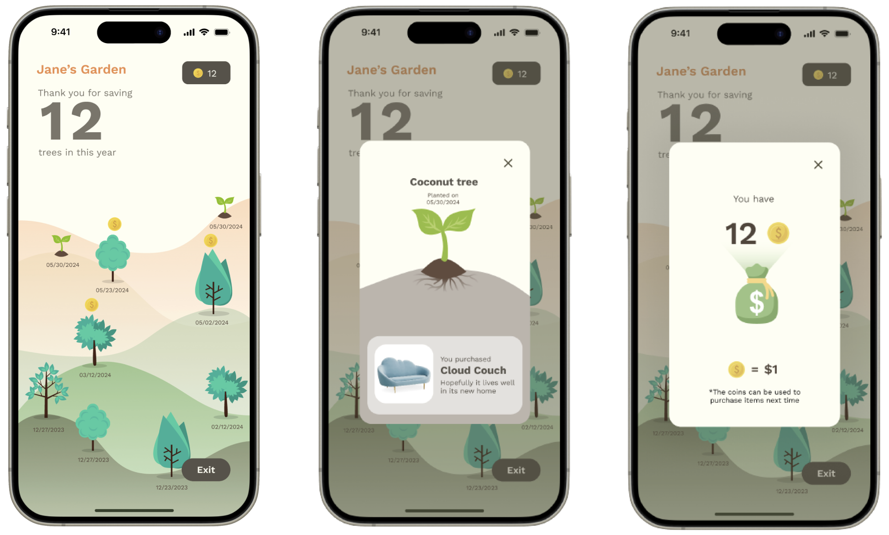
Users initially didn't understand how the rewards system works. |
The instruction of how users can benefit from the rewards system should be provided clearly to ignite motivation for people to purchase/sell furniture on our platform. |
Users found the rewards not incentivizing enough due to the static page design. |
The rewards system should better emphasize the sustainability concept through a more intricate storyline and engaging interactions. |
